Minecraft has been around for the past 11 years and is still going strong, this Article will talk about the Minecraft Logo History and How It Evolved.
The very first ever logo for Minecraft was created by Hayden Scott-Baron in 2009, It was a bold sans-serif inscription with jumping letters, glued to each other.
The massive bodies of the letters featured a bright blue and green pattern, where blue was a sky, and green — earth. but it was never really used by the brand itself and change over the years.
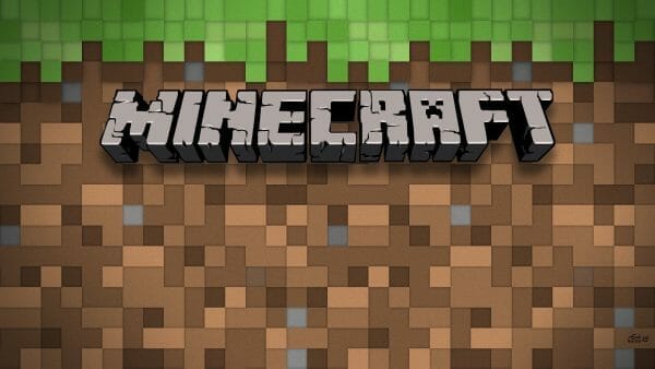
The Minecraft logo we know today was created by Markus Persson in 2011 and is considered the most well know one of all the Logos.
The Meaning of the Minecraft Logo
Although the logo of the now very popular sandbox RPG video game Minecraft has been modified several times over the years.
Its core “building material” – cobblestone – has been used in each and every version symbolizing that no matter how many changes the game might have over the years its core will never change which is to answer the question "What Is Minecraft" as may already know Minecraft is one of the most popular online RPG sandbox games that was created in 2011.
Minecraft allows players to create their own worlds and scenarios and can be played either alone or in groups, via a local network. Funny enough some resource packs and mods allow you to change the logoo.

History and Evolution of the Minecraft Logo
The original Minecraft logo featured a black and white “Creeper” with the Minecraft font below it. This logo is still seen on Minecraft merchandise today, however, the official Minecraft brand has changed the logo several times over its history to reflect the changes in the Minecraft game.
The second Minecraft logo, which was used from 2011 to 2014, featured a colorful pixelated Minecraft character with the same Minecraft font at the bottom. This version of the Minecraft logo gained much more attention and recognition as it had some subtle changes to make it look more modern and eye-catching.

In 2014, Minecraft changed its logo to a more simplified version of the previous design. The Minecraft character was now an abstracted version, with only two colors and the Minecraft font at the bottom remained unchanged.
In 2017, Minecraft completely redesigned its logo to further reflect its changing landscape. This new Minecraft logo featured a 3D Minecraft character in vivid colors with a Minecraft font below it. This logo is still used by Minecraft today and is considered to be the most recognizable Minecraft logo ever created.

What Does the Minecraft Logo Represent
The Minecraft logo not only reflects how Minecraft has evolved over the years, but also how far its popularity has grown.
From a small indie game in 2009 to one of the world’s biggest cultural phenomena in 2017, Minecraft has come a long way – and its logo has been there to document the journey. Minecraft’s logo history is a testament to its ever-increasing popularity and recognition.
Minecraft may have changed throughout the years, but its beloved logo has stayed the same. Minecraft fans can take comfort in knowing that no matter how much Minecraft changes, its core identity remains intact – thanks to its iconic logo.
How Iconic is the Minecraft Logo
Swedish-born Mojang is a well-known provider of gaming software. Jonas Mrtensson is the CEO of the business, and its headquarters are in Stockholm.
Currently, the firm is a section of venerable Microsoft's Xbox Game Studios in the United States. In addition to its great leadership, Mojang is renowned for creating the enduring Minecraft video game. New, fascinating versions are continually being created as a result of this improvement.
This means that the Minecraft insignia or symbol will be remembered throughout the test of time pretty much like other classic video games.

 TOP PACKS